
UX/UI Design • Mobile App Design
TOOLS: Figma, Adobe Illustrator, Adobe Photoshop
This was a project completed for a UX/UI Design course at Concordia's CCE. The goal was to create a mobile application in any industry, and to prototype five screens for the application.
This was a collaborative project with teammates Stephanie K. and Nina B.
We chose to target a sector where all of us often encountered frustrations: online banking. We decided to base our project on resolving problems we found within apps such as RBC and TD, as those were the examples we currently use. And with digital nomadism and remote work on the rise, we decided to cater our product to a younger demographic who would require a banking app untethered from physical locations, and that could stand on its own to complete the most essential banking tasks, simply and efficiently.
Thus, ROAM Bank was born.
Thus, ROAM Bank was born.
We started by identifying our UX/UI goals for the app. We highlighted 4 of the most common tasks performed via banking app, pulling from our own experiences, and asking family, friends and peers.
Those 4 tasks we isolated were: (1) Deposit cheques, (2) Verify account balances, (3) E-transfers and money transfers, and (4) Pay credit cards or LOC.
Those 4 tasks we isolated were: (1) Deposit cheques, (2) Verify account balances, (3) E-transfers and money transfers, and (4) Pay credit cards or LOC.
Our second goal was to resolve previously identified frustrations with existing apps, such as convoluted navigation, and too many redundant clicks. We wanted a snappy, easy-to-use app that would be seamlessly navigated by users.
Our final goal was to convey a sense of ROAM, a modern platform for the digital nomad. We did this through the visual design of the brand and the app; using splashes of flashy colours while remaining within the trustworthy blues typical of banking, using a modern but readable font for the app's text, and through sleek icons, futuristic photography, and clean navigation.
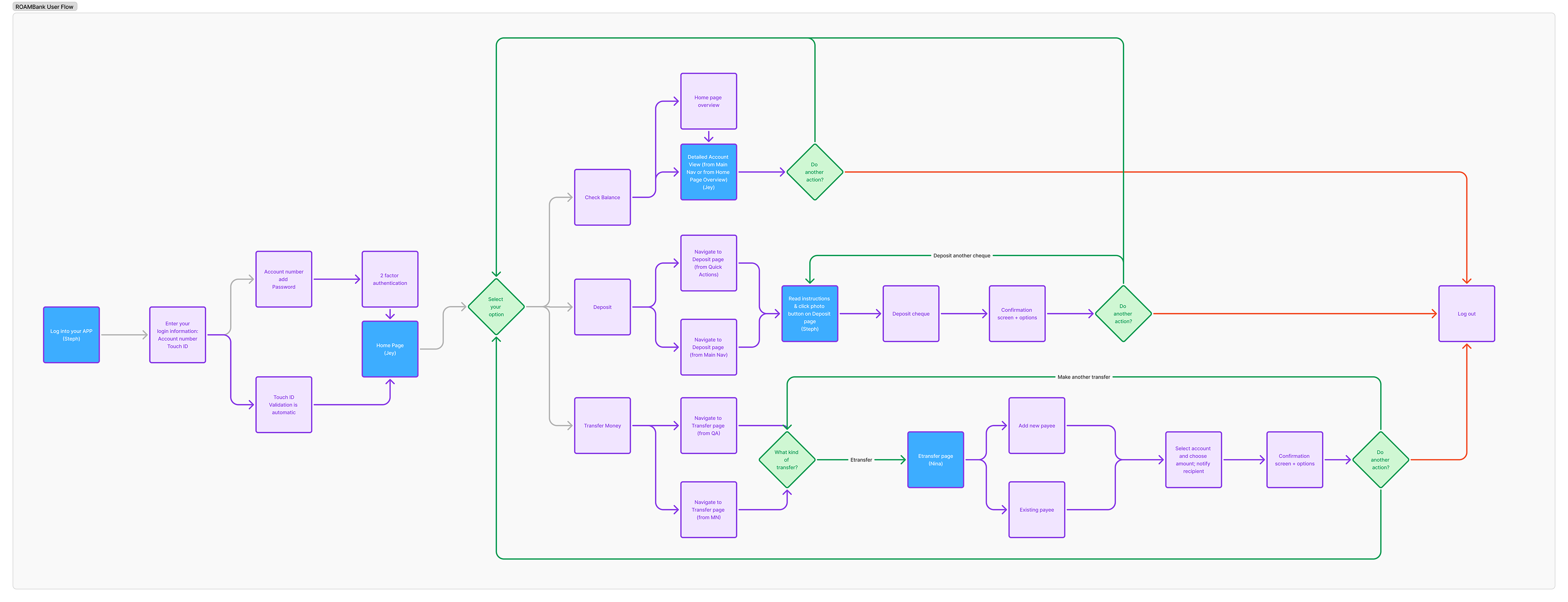
We mapped the app's complete user flow using those 4 common actions, and identified which screens were most important to prototype: Login, Home, Detailed Account View, Deposit Cheque, E-transfer.
STYLE TILE
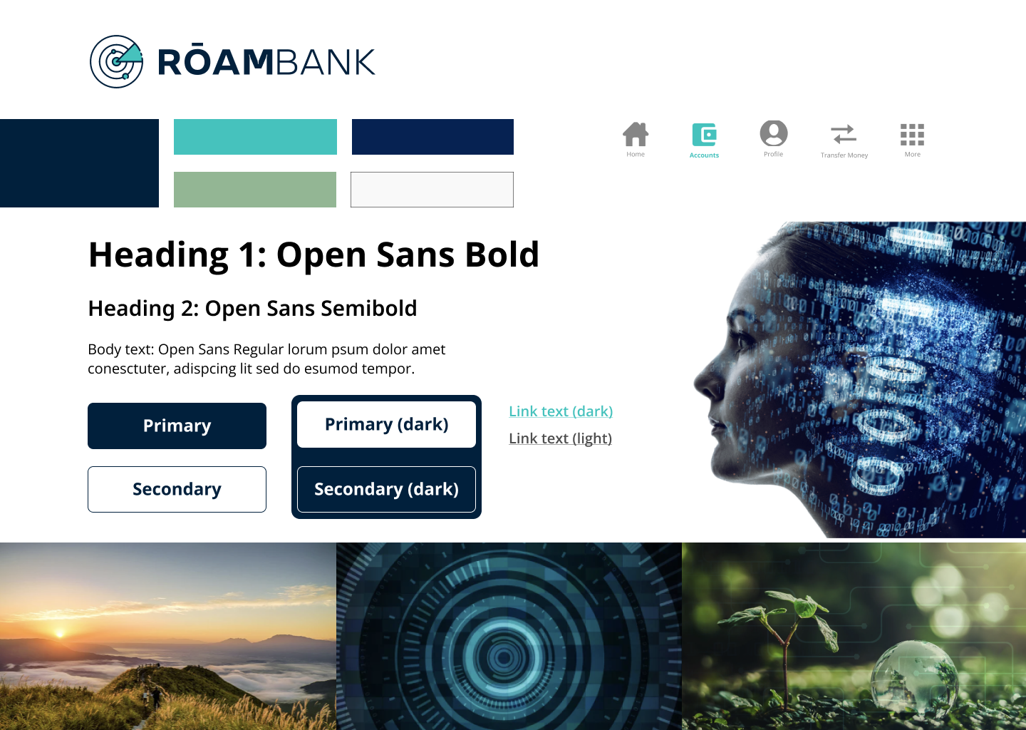
We laid out the Style Tile, identifying colours, fonts, button styles, link text, and icons. We also added evocative photography to represent the brand we'd created - modern, nomadic, and digitally innovative.
LOGIN
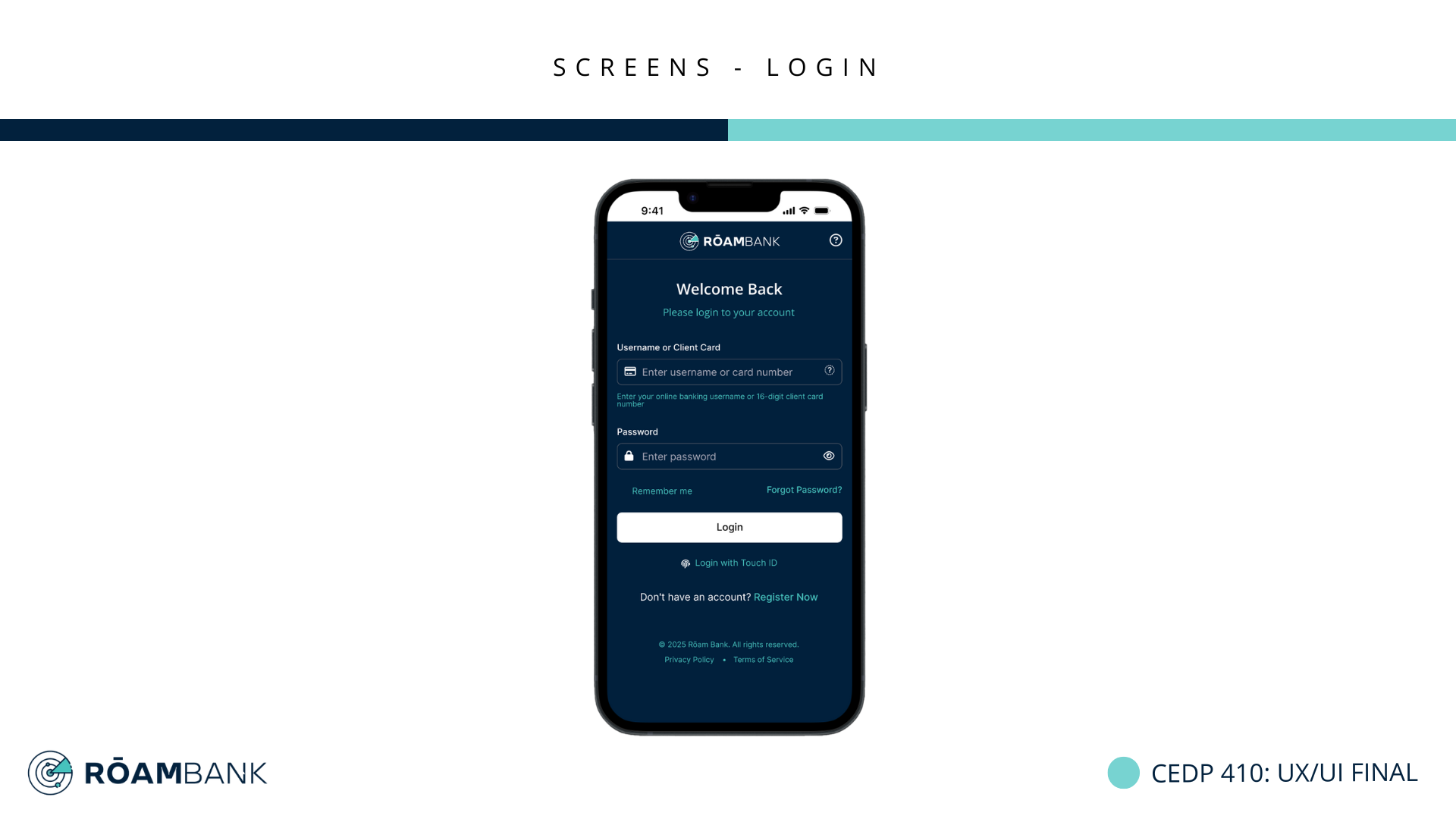
We designed a clean, complete login page where users would begin their journey. We improved on the pain points we'd identified earlier in existing apps, namely clutter, poor visual hierarchy, and inefficient use of the phone screen's space. We also added the option to log in with Touch ID, as this feature is increasingly popular but notably missing (or not obviously visible) in several large banking apps.
HOME
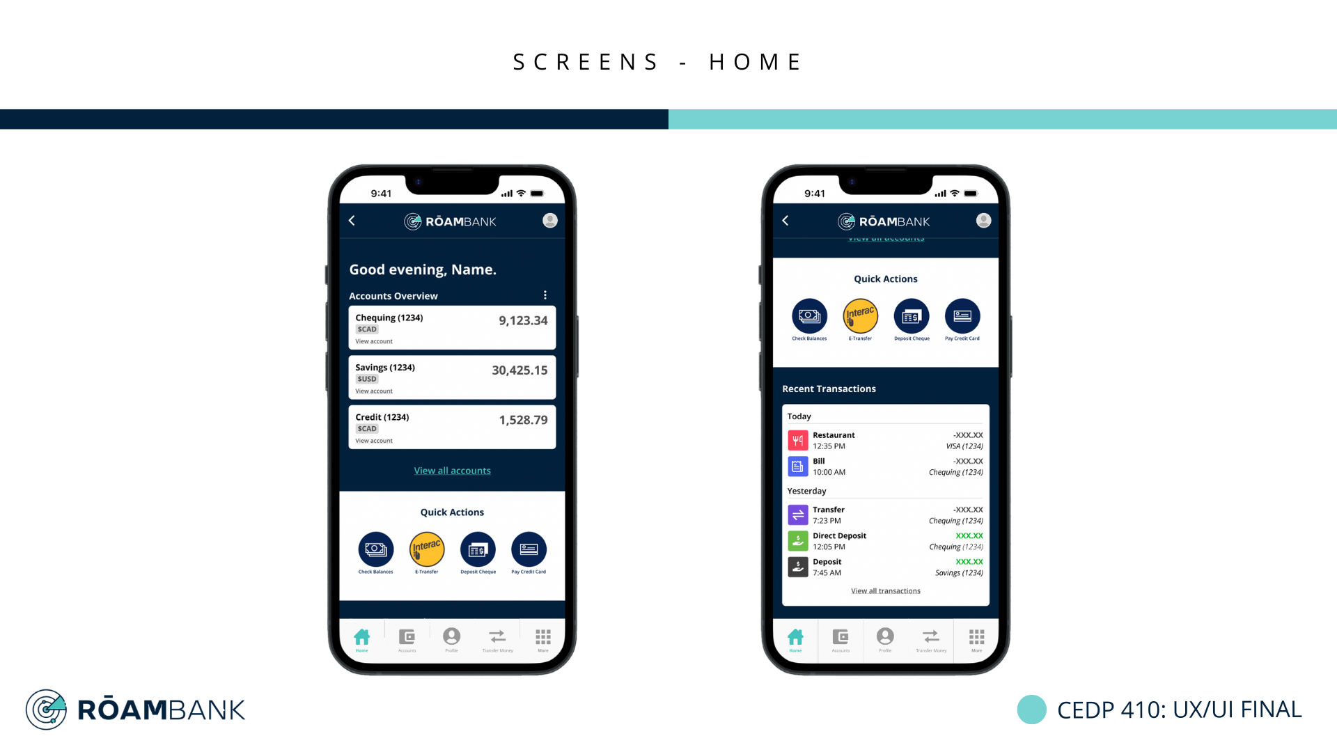
Once users are logged in, they are immediately given essential information (account information, recent transactions) in a clear and legible layout, as well as shortcuts to the basic tasks we'd previously identified, through the Quick Actions section. We also created a sticky navigation bar that would remain the same through each screen, unlike the navigation bars we'd observed in other apps, where menu items would be different and inconsistent depending on the screen. This had the goal of reinforcing a seamless experience for users as they navigate the app and complete their banking tasks.
DETAILED ACCOUNT VIEW
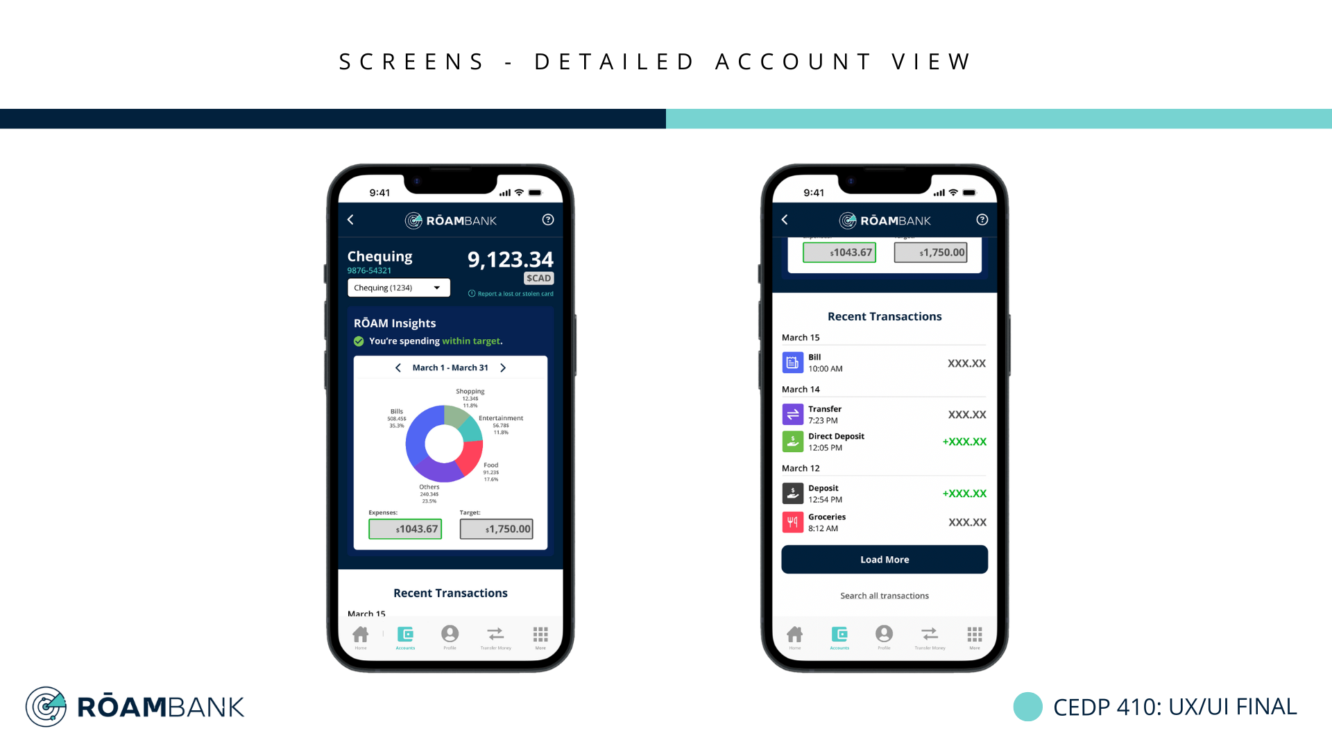
For the detailed account view, we decided to add visualizations to accompany a sort of "budgeting" function we'd workshopped for this bank. This feature would track users' expenses based on the budget they'd previously set for the month, and inform users if their spending was within target. This would be an optional feature, but we figured we would show what it could look like. As we were targeting a younger demographic, the visualizations had the goal of keeping these users' attention and creating an overall positive experience when working within a budget as a student, a young professional, and/or a digital nomad.
DEPOSIT CHEQUE
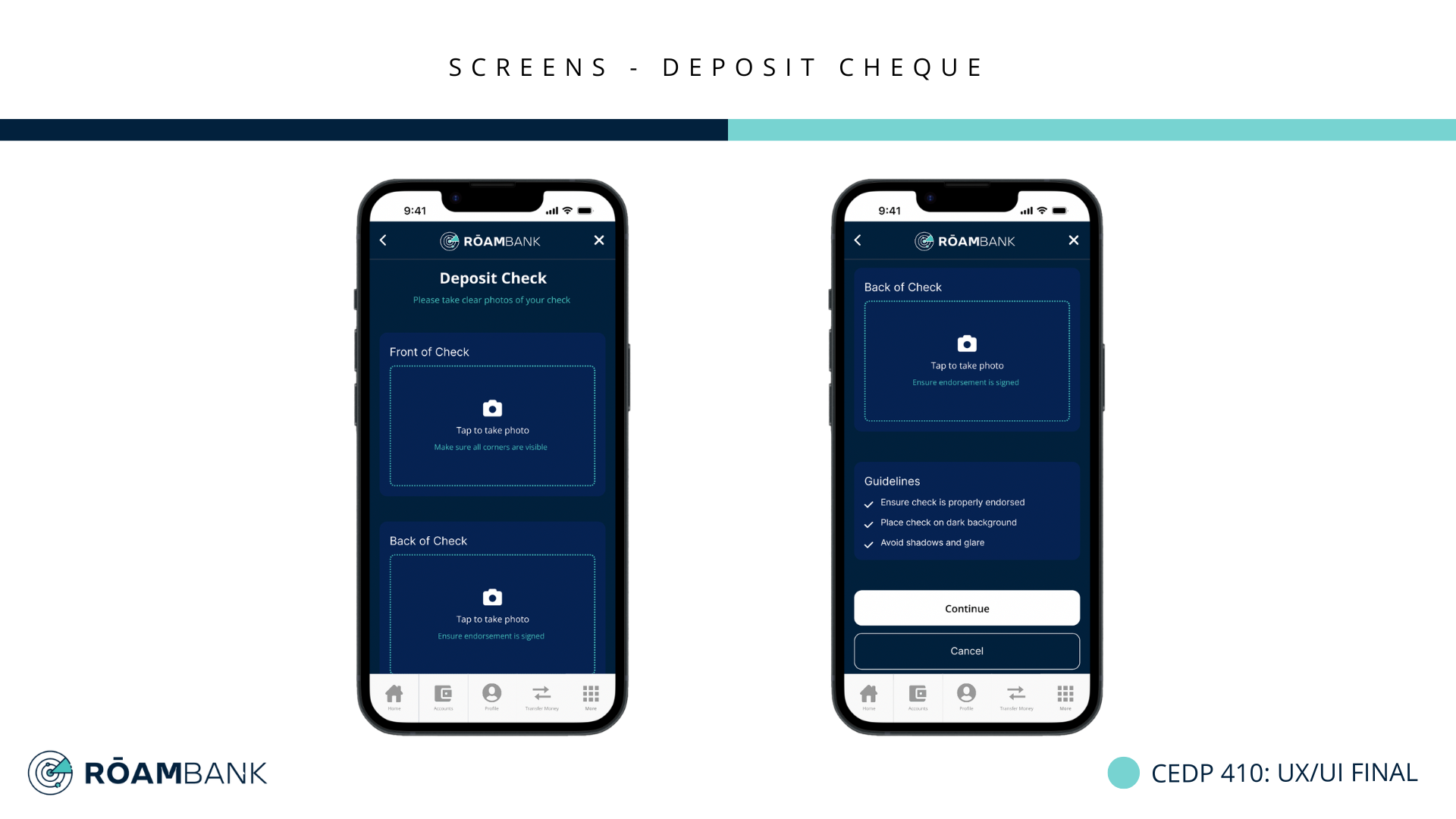
The cheque deposit screen was designed with a fast and simple experience in mind. We prioritized clean instructions using universal icons and visuals - the camera and dashed lines denoting a photo input is required from the user - and added written instructions to minimize the risk of a failed photo.
E-TRANSFER
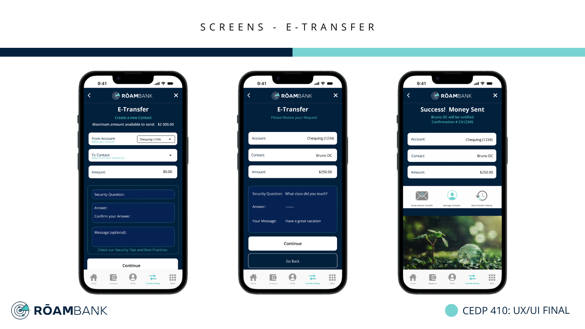
For the e-transfer page, we identified three steps to the process. First, the user inputs all necessary information: the account, the recipient, the amount, and security information. Next, the user is asked to confirm this information and send out the transfer. Finally, the transfer is sent, and the user receives confirmation that this task is complete. We kept this page simple yet clean, again emphasizing areas for user input using dashed lines, and keeping the user flow in mind, we highlighted potential next actions for the user once a transfer is completed - users are immediately given the option to send another transfer, to manage contacts, and to view transfer history without having to go through navigation again.