

UX/UI Design • Web Design
TOOLS: Figma, Adobe Illustrator, Adobe Photoshop
This was a project completed for a UX/UI Design course at Concordia's CCE. The goal was to improve the user experience for a chosen website (web experience only) through a redesign that was user-centric and responded to user goals, and to focus on three pages. I chose the website for Aquadôme, an aquatic complex that boasts three large pools and holds aquatic activities such as fitness and swimming courses.

I started by outlining the existing design and functionality issues with the original website, and explored how these factors impede the user experience. I gathered these issues through my own observation as well as by asking peers, family, and friends to navigate the website.

The visual design was unappealing, with mismatched fonts, text sizes, and colours applied throughout. Many of the elements on the website were broken or malfunctioning, such as the carousel and many buttons. The users I consulted reported not feeling confident as they navigated the website, as they felt overwhelmed and did not know where to go to get information and register. They also reported issues with scrolling through the website and broken links, both of which I was able to replicate on several different browsers. It was clearly made without the user's journey in mind (or perhaps it was lost in the process of updates over the years) and likely resulted in a high bounce rate, so my next step was to craft that user journey, again, with the help of feedback from potential users.

I honed in on a main goal that was most commonly reiterated by users: to register for an activity. To ensure a seamless process, I mapped out all possibilities for users who would land on this page, keeping the isolated goal of registration as a focus and ideal end-point. For users who aren't familiar with Aquadôme's activities or are undecided on an activity, a robust homepage with clear direction would be required. And for those who already have an activity in mind, a seamless process from landing on the home page to completing registration would be ideal. The original website had multiple convoluted redirects when attempting to register for an activity, so I knew I had to restructure that experience.
Homepage
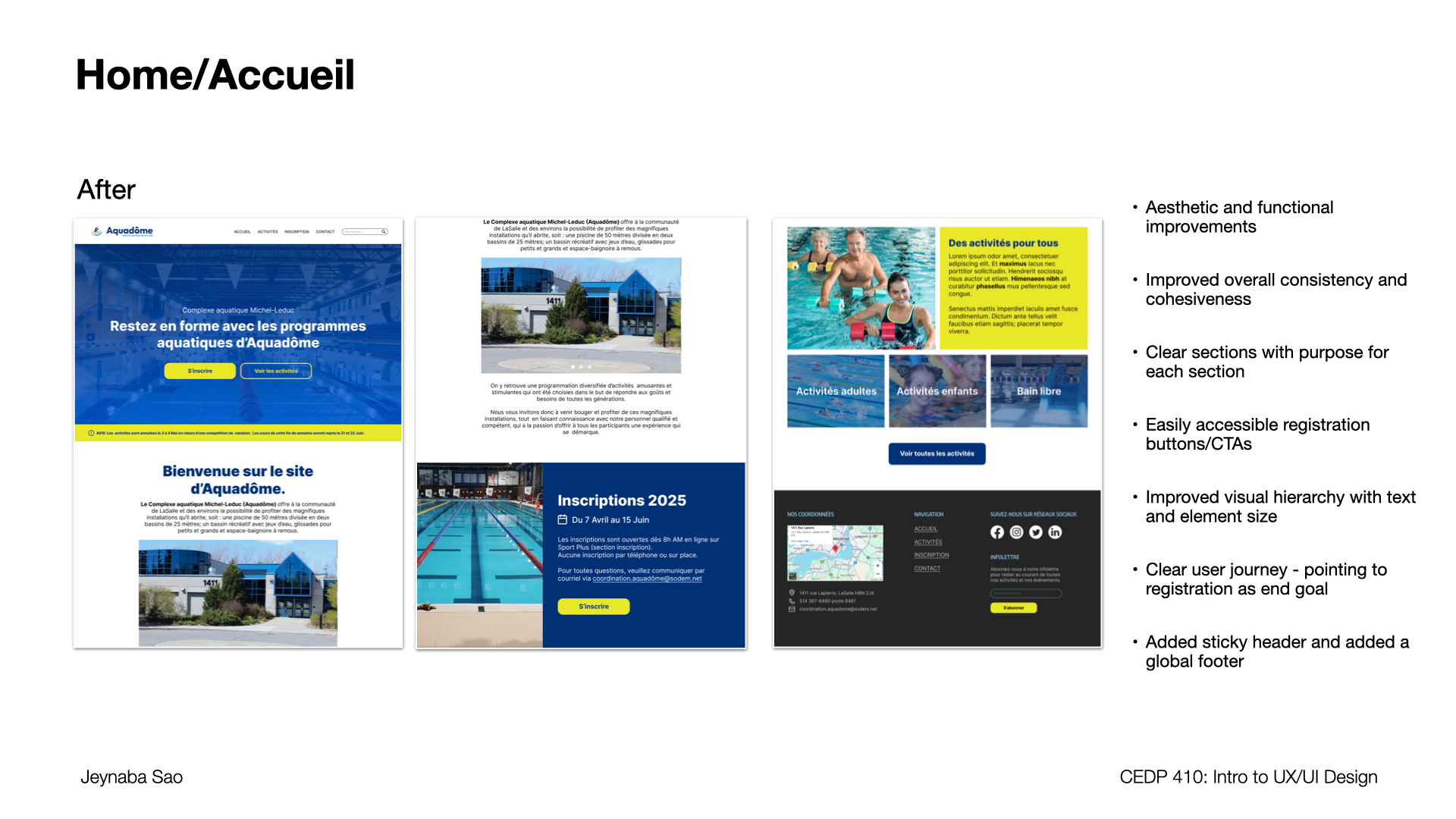
The first step of the user's journey starts on the homepage, so I prioritized cleaning it up and ensuring its functionalities were seamless.
I quickly repurposed a stock image to freshen up the logo (as it was not the focus of this assignment), pulled from the existing colour palette and refined it to define all colours used, and set out a system for headers, body text, and buttons that utilized a singular font to return cohesiveness and consistency to the visual design.
I separated the home page into purposeful sections, each still recalling the end goal of registration. I reinforced this goal by using two calls-to-action in the hero section, which, although present in the original website, did not stand out due to poor contrast and an unusual hero section size. The primary call-to-action was the registration button ("s'inscrire"), and I ensured it was the highest-contrast element in the hero section.
As for the page and the website's overall design, I used font size and weight, as well as element size, to introduce visual hierarchy to make the information more digestible and clear. Again, this helped with cohesiveness, as I kept the same rules for all pages. Finally, I added a sticky header and footer to all pages for easier and more consistent navigation.
Activities

The activities page posed a challenge in the way that it was structured as well as discrepancies with the main navigation. The activities tab produced a dropdown menu, but the word itself did not lead to a page, depriving the users of a page where they could browse all activities in one place. Users would need to click multiple times to browse through different categories of activities, which would likely result in frustration, impatience, and users leaving the website. Each activity also had an individual registration button, which was misleading as they all led to a convoluted registration page with no differentiation for each activity.
To solve for this, I organized the large amounts of information within a collapsible accordion, structuring the information using visual hierarchy. I added a single button for registration to align with what users would see once they clicked it -- a single registration page where activity differentiation would then occur via form.

The registration page, where users would ideally convert to paying clients, was complex, confusing, and lacking a clear direction for the user to take to complete the desired action. I completely reworked the page, turning it from an information dump to a form where users could take impactful action - filling a form - and see a live response to their action -- selection and confirmation -- as opposed to a static page without the interactions being immediately visible. Again, I added clear fields and a clear confirmation button where users could input their information, select an activity, and register all within one page, completing the goal of registration from start to finish.